Contents
- Basic Requirements
- Default Props Overview
- Utils
- Integrating into the Component
- Usage
- Links
Basic Requirements
The only external dependency required is the prop-types package for Type Checking or Prop Validation.
Other than that, we need one custom speedometer needle image.

Default Props Overview
  defaultValue: 50,
  minValue: 0,
  maxValue: 100,
  easeDuration: 500,
  labels: [
    {
      name: 'Too Slow',
      labelColor: '#ff2900',
      activeBarColor: '#ff2900',
    },
    {
      name: 'Very Slow',
      labelColor: '#ff5400',
      activeBarColor: '#ff5400',
    },
    {
      name: 'Slow',
      labelColor: '#f4ab44',
      activeBarColor: '#f4ab44',
    },
    {
      name: 'Normal',
      labelColor: '#f2cf1f',
      activeBarColor: '#f2cf1f',
    },
    {
      name: 'Fast',
      labelColor: '#14eb6e',
      activeBarColor: '#14eb6e',
    },
    {
      name: 'Unbelievably Fast',
      labelColor: '#00ff6b',
      activeBarColor: '#00ff6b',
    },
  ],
needleImage: require('./images/speedometer-needle.png'),value: Current value
defaultValue: Initial value
minValue: Minimum limit
maxValue: Maximum limit
easeDuration: Ease duration of the needle animation
labels: List of labels with color
needleImage: Absolute path to the needle image
Utils
There are three types of Utility functions that are required.
- Calculate Degree from Labels
- Calculate Labels from Value
- Limit Value
Calculate Degree from Labels
This Simple Utility function will return the per label degree from the list of labels.
  function calculateDegreeFromLabels(degree, labels) {
    const perLevelDegree = (degree) / (labels.length);
    return perLevelDegree;
  }

  export default calculateDegreeFromLabels;
The total degree of the circle is divided by labels length to give per level degree.
Calculate Labels from Value
This Utility function will return the current label from the list of labels based on the current value of the speedometer.
  function calculateLabelFromValue(value, labels, minValue, maxValue) {
    const currentValue = (value - minValue) / (maxValue - minValue);
    const currentIndex = Math.round((labels.length - 1) * currentValue);
    const label = labels[currentIndex];
    return label;
  }
First, the value of the speedometer is normalized to a percentage based on the
maxValue and the minValue.
Then the current index of the label is calculated by multiplying it to the length of the labels list. (The index is always 1 less than the actual).
At last, we can return the label from the list based on the calculated index.
Limit Value
This Utility function is used to limit the current value between maxValue and
minValue .
  function limitValue(value, minValue, maxValue, allowedDecimals) {
    let currentValue = 0;
    if (!isNaN(value)) {
      if (!isNaN(allowedDecimals) && allowedDecimals > 0) {
        currentValue = parseFloat(value).toFixed(allowedDecimals < 4 ? parseInt(allowedDecimals) : 4);
      } else {
        currentValue = parseInt(value);
      }
    }
    return Math.min(Math.max(currentValue, minValue), maxValue);
  }
Integrating into the Component
Adding the Styles
  wrapper: {
    marginVertical: 5,
    alignSelf: 'center',
  },
  // Circular Container
  circleWrapper: {
    overflow: 'hidden',
  },
  outerCircle: {
    justifyContent: 'flex-end',
    alignItems: 'center',
    overflow: 'hidden',
    borderColor: '#ffffff',
    backgroundColor: '#e6e6e6',
  },
  halfCircle: {
    position: 'absolute',
    top: 0,
    left: 0,
    borderTopRightRadius: 0,
    borderBottomRightRadius: 0,
  },
  imageWrapper: {
    position: 'absolute',
    left: 0,
    zIndex: 10,
  },
  image: {
    resizeMode: 'stretch',
    height: width - 20,
    width: width - 20,
  },
  innerCircle: {
    overflow: 'hidden',
    justifyContent: 'flex-end',
    alignItems: 'center',
    backgroundColor: '#ffffff',
    width: width * 0.6,
    height: (width / 2) * 0.6,
    borderTopLeftRadius: width / 2 - 10,
    borderTopRightRadius: width / 2 - 10,
  },
  labelWrapper: {
    marginVertical: 5,
    alignItems: 'center',
  },
  label: {
    fontSize: 25,
    fontWeight: 'bold',
  },
  labelNote: {
    fontSize: 16,
    fontWeight: 'bold',
},wrapper: Wrapper styles.
outerCircle: Outer Circle styles.
innerCircle: Inner Circle styles.
halfCircle: Used to build label blocks between outer and inner circle.
imageWrapper: Speedometer Needle Image Wrapper styles.
image: Speedometer Needle Image styles.
label: Label styles.
labelNote: Label note styles.
Constructing the static component based on the styles
  {labels.map((level, index) => {
      const circleDegree = 90 + (index * perLevelDegree);
      return (
        <View
          key={level.name}
          style={[style.halfCircle, {
            backgroundColor: level.activeBarColor,
            width: currentSize / 2,
            height: currentSize,
            borderRadius: currentSize / 2,
            transform: [
              { translateX: currentSize / 4 },
              { rotate: `${circleDegree}deg` },
              { translateX: (currentSize / 4 * -1) },
            ],
          }, halfCircleStyle]}
        />
      );
  })}
By adding this your, component speedometer will look like this

The reason to add style objects in an array is that we’ll be appending more styles to it later on.
Adding the Utils
  const degree = 180;
  const perLevelDegree = calculateDegreeFromLabels(degree, labels);
  const label = calculateLabelFromValue(
    limitValue(value, minValue, maxValue, allowedDecimals), labels, minValue, maxValue,
  );
The initial degree is set to 180 for a semi-circle.
Now we get the perLevelDegree and label based on the value supplied as the
props.
circleDegree is calculated for each halfCircle style based on the current
label index and the perLevelDegree. 90 is added to it because our circle
starts as a semi-circle.
The background color of our half circle is set based on the label that we get from our util.
Next we use transforms to position and rotate our block based on the
circleDegree.
Adding the above changes will make the speedometer will something look like this

Adding the Animations
  Animated.timing(
    this.speedometerValue,
     {
      toValue: limitValue(value, minValue, maxValue, allowedDecimals),
      duration: easeDuration,
      easing: Easing.linear,
      useNativeDriver,
     },
   ).start();

  const rotate = this.speedometerValue.interpolate({
    inputRange: [minValue, maxValue],
    outputRange: ['-90deg', '90deg'],
  });
First we need to initialize the speedometer value in the constructor. Then, we add the animations based on the current value limited by our utility function.
The output range is set in between -90deg to 90deg for the needle to
animate.
Now this component is ready to be exported and used.
Usage
state = {
value: 0,
};
onChange = value => this.setState({ value: parseInt(value) });
render() {
return (
<SafeAreaView style={styles.container}>
<TextInput placeholder="Speedometer Value" style={styles.textInput} onChangeText={this.onChange} />
<RNSpeedometer value={this.state.value} size={200} />
</SafeAreaView>
);
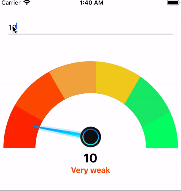
}After making the necessary changes and updating value based on the TextInput
the component will look like this.
Links
The complete code can be found on
as react-native-speedometer package.